Archive

Progress

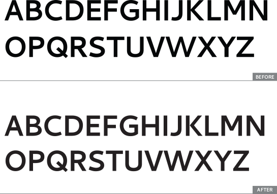
On the heels of the changes made to lowercase letters in Cantarell Bold, the outlines and spacing of the uppercase letters has also been reviewed and corrected. Some changes worth highlighting include the K, which now matches the design of the regular; the curves in the bowls of the P and R, which are much smoother now; and the widths and proportions of E and F.


BoldUC-1

Here’s a comparison of the old and new versions—


BoldUC-2

See related bug 707359.

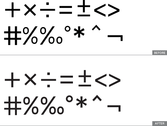
Along with reviewing and making corrections to the numerals in Cantarell Regular, I also looked over a small set of symbols used for mathematics. Some of them—such as the # and *—were heavier than the rest of the design and stood out as bolder. Others—like the %, ‰, ° and ^—were too light.

See related bug 703260.

MathSigns

And while I didn’t find the time to tackle this during the internship, I have raised a new bug with a short list of missing mathematical symbols as well.

Just like the alphabet, the numerals in Cantarell Regular also received a face-lift in August. Their outlines have been improved and then they have been re-spaced. The number 2 in particular has a much more elegant shape now. The other major change is to the shape of the number 3, which now matches more closely to the original design.

See related bugs 703166 and 703197.


Cantarell Regular Numerals

I’ve finally finished all the research needed to list the characters missing for complete language support for the top sixty translated languages using Latin in GNOME’s localization list for stable release 3.8. With support for Romanian sorted out, there are only five languages with missing glyphs—Danish, Slovak, Serbian, Vietnamese and Asturian—and detailed bugs about these have been filed.

Read my original post about researching extended Latin support here.

I’ve written about the challenges I have been facing with anchors on FontForge earlier. To move away from that even if the problem is still unresolved, I have focussed my energies on the bold weight of the basic Latin character set of Cantarell.

Since I have seen this typeface, even in the specimen that was submitted at the University of Reading, I’ve felt that the bold weight of the design doesn’t work as well as it could. First, it feels too wide. So much so that when seen in the context of the regular, it looks like a different width altogether. Second, many shapes look clunky and the quality of their drawing could do with some improvement. Some refinements in the joins, especially some subtle thinning would make the shapes much better. In addition, the letters with diagonals like the v, w and y look much lighter than the rest—an issue I also found in the regular. Finally, because both weights of the typeface have seen several changes over the years, including the ones I have made during the course of the internship, their designs have diverged.


BeforeAfter

Improvements to Cantarell Latin Bold.

With these issues in mind, I have completed the first round of changes to the lowercase basic Latin character set. This includes not only drawing, but also respacing these glyphs. There is certainly more to be done, in the spacing department in particular, but the improved glyphs already look like a good start.

Bold

The new version of Cantarell Bold with its Regular counterpart.

It has been a tough couple of weeks trying to build accented characters for the extended Latin character set using anchors on FontForge. Redrawing the accents to harmonize better with the letters they attach to as well as with each other has been relatively easy. When I’ll finish work on this bug, the extended Latin characters will have different accents for the lowercase and uppercase letters, designed to work well with their respective weights and space above them.

Extended Latin
The difficult and yet unresolved problem is how to get FontForge to use the correct accents to build accented glyphs. Despite showing the correct set of components that it should use to build these glyphs in the Glyph Info panel, FontForge continues to not use the combining accents in several cases. Correcting all the glyph names to match the Adobe Glyph LIst has not helped at all. Dave was afraid I was using a very old version of FontForge and that might be the problem, but that’s not it either. At this point, I’m really not sure what the issue is or could possibly be.

Unfortunately, this roadblock has taken me off schedule—taking much more time than I had anticipated it would (even delaying a blog post here!). I’m attending GUADEC at Brno this week and Jakub has organized a hackfest for Cantarell on Monday. Hopefully, we will be able to figure out this problem then.

Among the larger chunks of work I am expected to finish during this internship is reviewing and correcting the existing Cyrillic character set of Cantarell. Along with ensuring that the glyphs are properly drawn and spaced, my first and foremost priority has been to see if the letters do justice to their Cyrillic roots.

An improved version of both the uppercase and lowercase Cyrillic character set in the regular weight has been completed (the lowercase changes need to be committed). Some key changes that one might notice (in lower and upper case both) are to the letters д, л and љ, which now have a more resolved, well-drawn shape; л, п, ц, ш and щ, whose widths have been harmonised with each other and with other letters; ж, к and я that have been redrawn to be more consistent with their Cyrillic origins, rather than look like offshoots of similar looking Latin letters; ђ and ћ now have improved shapes and outlines; and, the bowls in letters в, ъ, ы, ь, љ and њ have been drawn again to have a consistent stroke width.

CyrillicSee bugs 703444 and 703588.

Last week I focused on improving the outlines and spacing of the basic Latin character set (a–z and A–Z) in Cantarell regular. This is an important step before I begin tackling the accented characters used for extended Latin. This way, I’ll be sure that the accented characters are built using good quality glyphs as building blocks. Apart from the alphabet, I also reviewed and corrected the outlines and spacing of numerals and related mathematical signs.

I raised and attempted to tackle the following bugs:

Bug 702713 [resolved]
Stroke widths in uppercase of Cantarell Regular are not harmonized properly

Bug 702955 [no patches yet]
Outline of uppercase U needs improvement

Bug 702956 [no patches yet]
The uppercase S needs to be redrawn

Bug 702987 [resolved]
Stroke widths in lowercase of Cantarell Regular are not harmonized properly

Bug 703094 [one patch attached + committed]
Review and correct spacing of basic lowercase letters in Cantarell Regular

Bug 703115 [no patches yet]
Review and correct spacing of basic uppercase letters in Cantarell Regular

Bug 703166 [resolved]
Review and correct outlines and metrics of numerals in Cantarell regular.

Bug 703197 [resolved]
Review and correct spacing of numerals in Cantarell Regular

Bug 703260 [resolved]
Review and correct the outlines and spacing of signs used for maths.

One of the first tasks I have begun to tackle in this internship is reviewing the support Cantarell extends to languages that use the Latin alphabet. There are several languages that employ the Latin alphabet (Omniglot lists over 300 of them) and Cantarell doesn’t support them all. Supporting each of those languages would not just be a monumental task, but is also not a necessity at this moment in time. What one needs really is for the typeface family to first support the languages in which people use (or wish to use) GNOME.

According to the localization information for GNOME’s stable release 3.8 (as accessed on June 18, 2013), out of the sixty most comprehensively localized languages, a little more than half—thirty-two—use the Latin alphabet. In its current avatar, Cantarell does not support all these languages. For some the addition of just a couple of new characters would solve the problem, whereas for other languages there are many more characters that are missing. Based on information collected from sources such as Omniglot, Micheal Everson’s Alphabets of Europe project and Akira Nakanishi’s book, Writing Systems of the World, I have worked out a simple spreadsheet that maps accented and other characters against the top sixty localized languages to quickly illustrate what is missing in Cantarell.

An in-progress screenshot of the spreadsheet: The rows marked in light blue do not use the Latin alphabet. The cells that are marked in red contain glyphs that are currently missing in Cantarell. Languages marked in green have full support and those in red don't. Bugs has been raised for the languages in blue cells, and purple means that more research is required before a bug can be raised.

An in-progress screenshot of the spreadsheet: The rows marked in light blue indicate languages that do not use the Latin alphabet. The cells that are marked in red contain glyphs that are currently missing in Cantarell. Languages marked in green have full support and those in red don’t. Bugs had been raised for the languages in blue cells. Purple indicates that further research is required.

This is work-in-progress. I am currently raising bugs that specifically list the glyphs that need to be added to the typeface family to support a particular language. Bugs for Danish, Slovak, Vietnamese and Serbian are already up, and a few more will follow soon. Once it has been ascertained exactly what is missing, I will get down to adding the required glyphs.